A Cat and Mouse game? An Analysis of San Francisco's Crime Data
The well-known image of cats catching and playing with mice before they eat them is a cliché that can be observed in real life. But thats not the only time we can see a predator-prey interaction. San Francisco crime data provides another potential story about this behavior covered in data. Let's take a deep dive into the dynamics of crime hotspots and police activities.
I. The Data: Find the Mouse and the Cat.
San Francisco is one of the biggest cities on the West Coast. Startups. Silicon Valley. Google. Golden Gate Bridge. Those are what tourists know about. But for locals, the perspective is different. Life in SF is about the daily hustle: finding a good school, navigating the housing market, and finding safe places for your kids to play. For any parent, understanding the neighborhood's safety isn't just a curiosity. It's what helps them sleep at night. To find some answers to that we will have a look at San Franciscos Crime Data from "Police Department Incident Reports".
The Police Department Incident Reports is an open-source database from the police department containing incidents reported by police officers or self-reported by members of the public from 2003 to the present. This analysis uses reports from 2003 to 2025. The data analysis focuses mainly on incidents reported under the categories warrant and drug offense. While a framework change in the 2018 dataset introduced some minor inconsistencies, the data has been meticulously cleaned and prepared to ensure the story remains accurate and reliable.
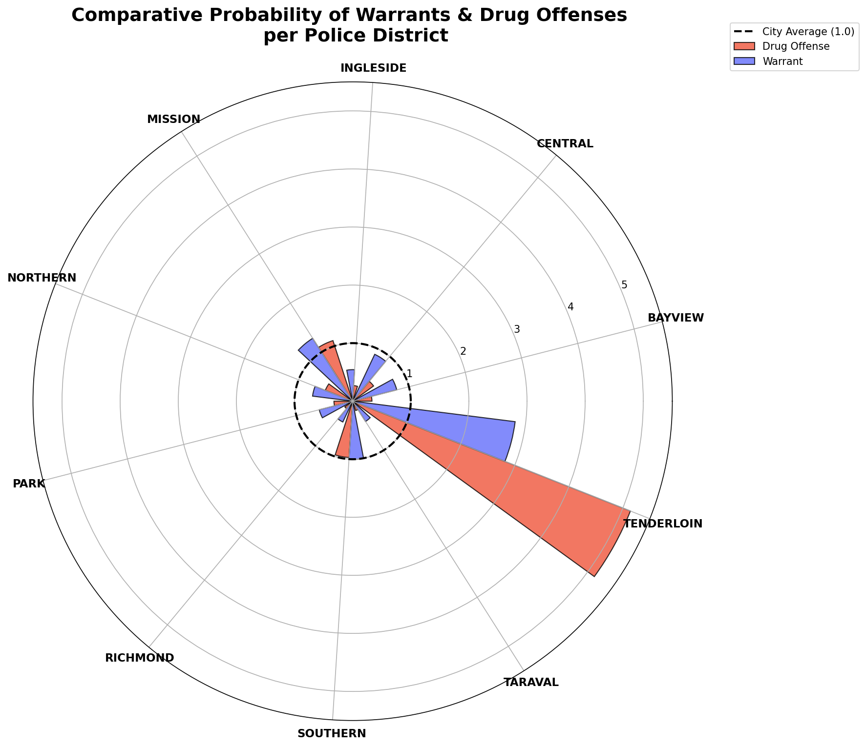
Figure 1. This Figure compares the probability of Drug Offenses and Warrants across San Francisco's ten police districts. The dashed inner circle represents the city-wide average (probability of 1.0). Any bar extending beyond this line indicates a district where that crime is over-represented compared to the rest of the city. The plot highlights a significant spike in Tenderloin, as well as smaller spikes in the Mission and Southern districts. In these districts, both crimes, warrant and drug offense, are close to or even five times higher than the average probability for the rest of the city.
II. San Francisco Map: Where are the hotspots?
When we look at the data, one neighborhood stands out immediately: the Tenderloin. Here, the probability of a drug offense is significantly higher than in the rest of the city. Interestingly, wherever we see a massive peak in drug offenses, a peak in warrants follows close behind. We see a similar, though smaller, pattern echoing through the Mission and Southern districts.
Is this overlap a mere coincidence or a predictable pattern? Should a family in the Tenderloin be more concerned than one in Richmond? Non of there authors have ever been to San Francisco, so we have to let the data speak for itself. To see how these numbers actually hit the pavement, let's transition from abstract probabilities to a geographic map of the city.
Figure 2. Choropleth map showing the absolute number of incidents across San Francisco police districts. Darker colors indicate higher counts of drug offenses (left) and warrants (right). The map reveals a clear spatial concentration of both drug offenses and warrants in the Tenderloin district. The numbers of drug offenses in the Tenderloin are significantly higher than in any other district. At the same time, the Tenderloin also exhibits elevated levels of warrant-related incidents, even if it is not the single highest district in that category.
The Tenderloin is one of San Francisco’s most densely populated and socioeconomically challenged neighborhoods, characterized by high levels of poverty, homelessness, and visible drug markets [1]. These conditions contribute to a strong spatial concentration of drug-related activity within a relatively small area.
At the same time, the Tenderloin is subject to intensified policing [2], increasing the likelihood that offenses are detected and recorded. This is particularly relevant for drug offenses and warrants, which are often generated through police activity rather than civilian reporting. As a result, these categories reflect both underlying criminal activity and enforcement patterns. The combination of high activity levels and strong police presence helps explain why the Tenderloin consistently dominates in both drug offenses and warrants, creating a feedback loop between policing and recorded incidents.
Comparing this map with the earlier ratio-based visualization reinforces a key insight. The Tenderloin is not only an outlier in relative terms, but also the main location where these incidents are concentrated in absolute numbers.
III. Dynamic Over the Years: How have the drugs hotspots evolved?
Now that we there is a clearer picture of the "where" we can ask ourselves about the "when". It is evident from the geographic map that Tenderloin, Southern and Mission are the main hotspots for both drug offenses and warrants, but are they also hotspots throughout time?. So to investigate the dynamic of the hotspots in this mousse and cat game, we can look at a Gapminder-like bubble plot that tracks the percentage of drug offenses and warrants for each district over time.
Figure 3. The figure above depicts the dynamic relationship between drug offenses (x-axis fixed to 30%, no exceeding districts) and warrants (y-axis fixed to 20%, no exceeding districts) across SF's police districts over time. The axes are scaled in percentages to allow for comparability and the bubble size represents total crime volume. We visualization has been split into 4 quadrants with the combination of low/high drug offenses and low/high warrants. The percentages for the quadrants are set by the average of all districts, giving an estimate of how big of a percentage any given city can expect on average.
IV. Conclusion
When interpreting the Gapminder figure, it is evident that Tenderloin is always a consistent hotspot for drug offenses and warrants, unsurprisingly indicated by the map in the geographic figure. However, in 2015 to 2024, we see a significant recession of drug offenses in Mission and Southern, which used to be smaller hotspots (compared to Tenderloin). From 2025 onwards, it seems that Southern and Mission are becoming prevalent hotspots again, suggesting the need for more attention to these districts. This complete district shift in adjacent hotspots emphasises the dynamic "Cat and Mouse" game, whether we look at probabilities, absolute volumes or temporal patterns, showing how the police (cat) is trying to catch up to the geographically shifting drug offenses (mouse). For the aforementioned parents and residents, the data overall paints a picture of a city with non-uniform crime distribution, often predictably concentrated around Tenderloin. Recognizing the dynamics is the first step towards changing the story, moving from a cycle of predator and prey to a city of safety and stability. It's kind of ironic how the cat just needs to sit in front of the mouse hole in the wall to make a good catch every time. Again and Again. Is this due to a stupid mouse or a lazy cat or just a dynamic in data?